In theory, each company should try to provide users with the best and most transparent experience possible. Sometimes, though, the dark side of the Force is really tempting, and designers decide to go with UX that’s misleading, deceptive, or even detrimental from the user’s perspective. What is dark UX? And what should you know about dark patterns in UX? Read on to discover answers to these questions.
It is more than likely you’ve encountered an example of the dark UX at least once in the past. Have you ever seen a pop-up ad that was extremely difficult to close? Or maybe the costs of the product went up shortly before finishing the order, or a “download” button turned out to be a hidden ad (or, even worse, malware)? These are all examples of dark UX.
Persuasive and deceptive design
In most cases, dark UX is the practice used by companies and websites that don’t care about transparency, good relations with customers, or ethical business in general. They just want to force or trick users into doing things they really don’t want to. As a result, sometimes, you can bump into a pop-up ad that doesn’t have the X button, and the only way to close it is by clicking the ad or the CTA button in it. But that wasn’t your intention, was it? It doesn’t matter, forcibly or not; you clicked the banner, so the goal was achieved.
That’s how persuasive and deceptive design works, and that’s what dark UX is all about. And it doesn’t refer just to ads; the list of so-called dark UX patterns is much longer (in a moment, we will show you the most common dark UX techniques).
Dark UX: meaning
In the broadest definition, dark UX refers to all UX practices that do not have the user’s interests in mind. If you design an app, a website, or an ad and purposefully make it misleading or obtrusive, you follow the disgraceful path of the dark UX. All such designs, interactions, and processes are sometimes referred to as dark patterns UX. Now, let’s have a look at the most harmful dark UX patterns.
Dark patterns UX
Bait and switch
The name is self-explanatory; at first, the user sees the bait, which can be:
- A link to download something (e.g., an eBook or software)
- Information about expiring license
- An attractive product offer
But when an inattentive user clicks such a link, they end up in a completely different place, sometimes dangerous concerning their personal or financial data. A good example of this technique are malicious push notifications displayed by fake antivirus websites:
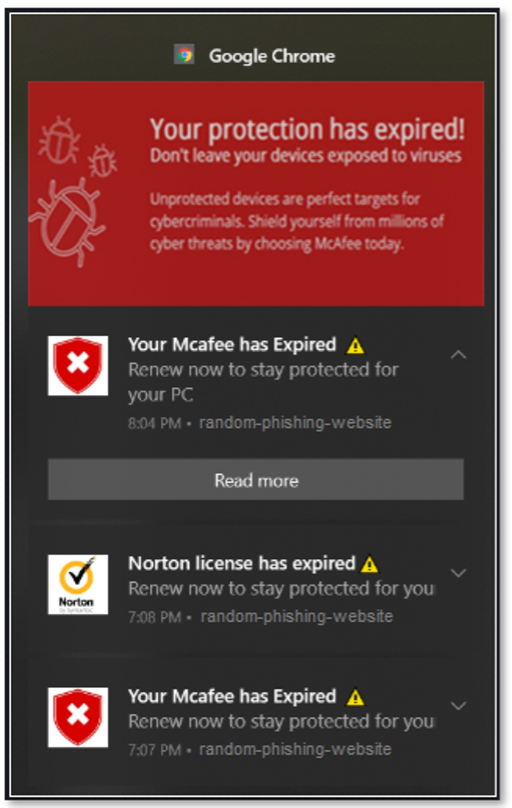
Clicking such an “ad” can result in getting your device attacked by malicious software. Such dark UX patterns frequently trigger fear or use the FOMO effect to trick the user into clicking the link without thinking too much about it.
Read also: Principles of Risk Management and Insurtech
Hidden costs
Have you ever gone shopping online, put some products in your cart, and finally discovered you had to pay more? That’s another dark UX practice known as hidden costs. Usually, these additional costs are taxes or shipping fees, and they can be legit. However, a transparent store (or any other website) informs about them beforehand so that users are aware of how much they will have to pay for the order.
Another version of this technique is based on showing the cost with the annotation “from” or hiding some of the important details. Take a look at this example from Google Flights. At first, you see that the flight from Calgary to London should cost you $1,340 and that it’s a nonstop trip:

However, if you get into details, you will see that the flight available at this price actually does have a stop and takes much more time (almost 22hrs instead of 9hrs).

Confirmshaming
This technique is based on making the user feel guilty for not clicking the offered option. Here’s a good example:

As you can see, users have just two options – they can give their email address and get a free guide or “admit” they are know-it-alls. Of course, the copy doesn’t say that explicitly, but that’s the result the author wanted to achieve. And more often than not, it works.
Read also: What is a digital customer journey?
FOMO
This acronym stands for fear of missing out, and it’s a genuine psychological phenomenon – people don’t like or want to miss out on anything beneficial or attractive to them. However, there is a dark UX pattern that exploits this natural human need and evokes FOMO when it’s not necessary.
For example, you may have seen ads or annotations in product tabs saying there are only a few spots/units available at this price, and you have to buy now. And if that’s true, everything’s fine.
Here’s an example of such communication from Booking.com:
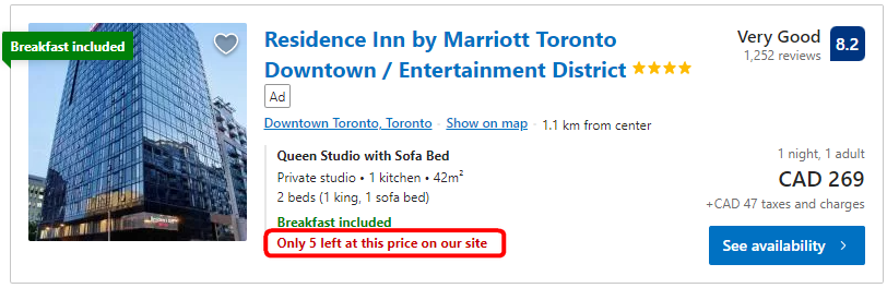
However, things change when you use this form of communication to trick more people into buying your products even when, in reality, there is no shortage of the product. In such a situation, that’s a dark UX pattern, and you’re deceiving your customers.
Privacy Zuckering
The last technique we want to mention is all about a sneaky way of forcing users to give up their rights or additional information without their knowledge. This usually happens when the user too quickly agrees to that by clicking a checkbox or stating they’ve read the privacy policy. The name, obviously, comes from Mark Zuckerberg, the founder of Facebook/Meta.
Do you want to be ethical? Steer clear of the dark UX
Companies that exploit dark UX do not care about their customers; they are all about achieving quick, short-term results. Believe us; it’s not a group you want to be a part of. If you want to build long-lasting relations with customers and ethically grow your business, avoid everything that resembles dark UX and always be transparent about your actions, offers, and the data you process.
Read also: Software design process: don’t think software, think tools!