


When it comes to large, widely-used systems it is generally a good idea to separate things. It's easier to maintain only one piece rather than the whole. One of the first thoughts should be the design system for your application. Why? Even if you are the creator, it's extremely hard to remember all of the variants and specific usage of each component. On the other hand, if you are joining an existing project, you can focus on your main task without wondering if you should create another component or just extend an existing one.
During the whole process of developing the design system there are many decisions to make and many traps to fall into. We will describe most of the concepts that we followed. We’re going with ReactJS and Styled Components throughout the rest of the article.
Main principles
The successful creation of a good design system includes strict collaboration between development and design. The former should translate all the visual concepts into well-maintained code and the latter should direct their creativity into the principles established at the beginning.

This is really important because things that are super simple at first sight, might be really difficult to implement at a later stage – for example adding a new color when you have a specific naming system or putting another space variant between large and huge – when all teams have been using your library for a year. It really is a core thing to have all this clear from the start of your project.
Always be prepared to expand your component
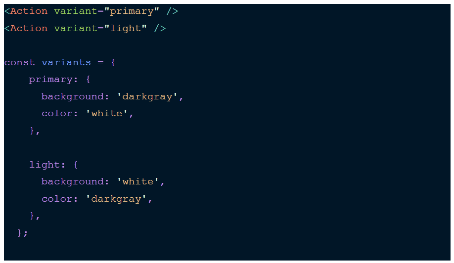
If at the start of your project you see two variants of an action, primary and light, beware of creating the component <Action /> with the primary color as a default and <Action light /> for the opposite. Sooner or later you’ll end up with something like:
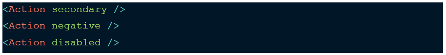
And with multiple ifs in your code to maintain all this mess. Furthermore, what if you have two props at one time? Which priority is higher? As you can see, it creates a lot of problems to be handled, but it doesn’t have to. It’s much safer to create a variant prop which will hold an infinite amount of colors and you can create a separate config to have it all in one place. Doesn’t it look better?
Read also: Painless Changelog
Always think if your functionality might not be needed somewhere else
It is a general rule that will always be applicable but if you feel that you’re writing the same thing repeatedly, it’s definitely a good idea to shrink it into a single util and share it between your components. Later you will be able to reuse small pieces of code easily. Isn’t it great just to run setGradient(from, to)’ instead of writing specific rules again and again?
Think widely about component usage
Where is the difficulty in creating a simple list with an avatar and some description? Technically there is no difficulty but you actually have to ask yourself some questions. Plenty of them are more obvious, for example how the list should be displayed at a different screen size, but others require some effort.
Like if a long description should be truncated or not. If there will be pagination or lazy loading in case of a large amount of data. Whether the data can be loaded asynchronously and you should use some kind of loader to avoid content jumping. It’s easy to forget about that and end up with an endless amount of bugs – but unfortunately the number of releases doesn’t lie. As a general rule, you should think about the most common contexts and prepare solutions for them.
Think about tree shaking from the beginning
Of course it is very tempting to start writing core functionalities immediately, but firstly you should wonder how your library will be distributed in the future. If you’re creating a bunch of small, reusable components, there is a high possibility that a given project will need only a few of them – so there’s no reason to download the whole bundle. You should allow the import of your components separately – modern module bundlers like webpack or rollup have this feature built-in.
Use external libraries wisely
Along the way you will have to make a lot of decisions whether to use an external library or write a custom module to fulfil a given task. In general we recommend following this rule: the more precise and narrow the application, the more sense it makes to use external libraries. When it comes to such specific subjects as animating height or debouncing, there are well-known and tested modules to handle this. There is a pretty small chance that library behaviour would differ from that required. On the other hand, if you need a robust solution, which is highly likely to undergo future changes, then try to write your own module. At first, it may not seem such a good idea to dismiss a component library written with a Material Design approach, when you have to add an input component very similar to one from the library.
But you have to ask yourself questions about possible variations of this input – how high is the probability that in the course of time this component would require a prefix, custom behaviour of a label or totally different error handling? If you are 100% sure that none of these issues may become a problem in the future, then you are good to go. But in most cases you won’t be given the right to be so certain, because the only thing with design systems that is beyond doubt is constant change. Furthermore, another solid argument about custom modules is bundle size. If you are using only a few components from a library that contains tens of them, there is no need to load them all. Of course external libraries can be tree-shakable, but that is another thing to check.
Start testing early
When you are creating small and uncomplicated components, tests may seem redundant but they are a crucial part of development. The library will expand a lot faster than you think and your users will expect it to work all through the process. Testing such essential features as passing onChange functions to inputs or `onClick` to buttons will definitely narrow down cases when you would have to release hotfix, because suddenly a passed onSubmit is not being triggered. To protect yourself from such events, simple snapshots tests won’t suffice. Write a lot of unit tests for util functions and integration tests for your components. People make mistakes as part of their nature and if you want to feel pretty sure about the output of your work then start testing early. You really don’t want to check manually if onSubmit works whenever a ticket is issued .
Read also: ISTQB certification for novices and experienced testers – is it worth it?
What was awesome
TypeScript
One of the most important decisions we made was to use TypeScript in our project. The number of benefits definitely outweighs any drawbacks. It makes the code easier to understand, maintain and refactor which directly results in a lower number of bugs. Additionally, by using VS Code IntelliSense we can enjoy such privileges as showing typing information and documentation in suggestions, hover info and signature help.
Styled components
There are plenty of ways of dealing with styles in the React application. We decided to use the styled-components library for many reasons. Firstly, it just looks like pure css, but it can do so much more. It supports scss syntax out of the box, it provides ThemeContext so you can create many versions of your application in an instant and crucially, you don’t have to worry about naming selectors, because it’s all scoped inside the component and final class names are generated. Apart from all that, all props can be passed to it, so you gain power to create reusable, customizable components easily.
Documentation
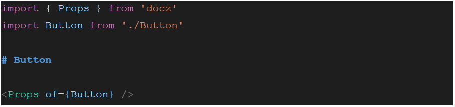
Nobody likes to write documentation, but it is essential in keeping a UI library. Users need to have a single source of information about props and component use. Fortunately, there is a quick solution to this problem. In our project we used the library docz, which in collaboration with TypeScript, documents the code almost by itself. All we needed to do was to write simple .mdx files with examples of usage. Props of a single component were read and displayed in a neat table by docz. To include props in your mdx we just had to add:
Our docs displayed a props table with available values and descriptions read from the props interface!
Versioning
To keep track of all changes we stuck to semantic versioning. For those unfamiliar with this system, its syntax is based on three numbers separated by a dot. The first number represents the major version, the second the minor version and the last one represents the patch. In our case we took this approach:
- major version: breaking changes to existing components (for example in props)
- minor version: adding new props or components to the library
- patch version: fixing components
Version management required from us planning and grouping changes in releases. We had to watch out for unintentional prop modification to keep our minor and patch releases compatible with previous versions. A list of all changes was kept in a single Changelog file for library users to bring themselves up to date with new modifications. During use, we found some difficulties in changelog management, especially during merge requests. We managed to solve this problem by adopting the concept described here.
RWD
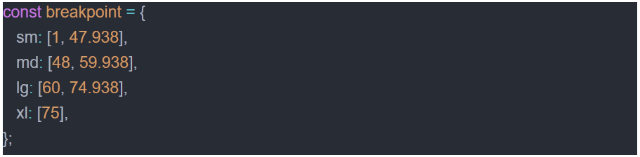
All current projects are created for multiple resolutions and ours isn’t an exception. We needed to use ‘media queries’ in various contexts, for which we prepared solutions that fully cover them. At the beginning, based on a Responsive Web Design approach we prepared a file with settings containing the required breakpoint dimensions (in ‘rem’ units):
These settings are used by all components, as well as helpers controlling behaviour in different resolutions. This is an essential requirement to keep coherence between them.
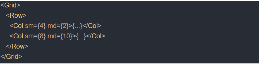
The grid is based on a 12 column division, but nothing prevents it making these values totally different:
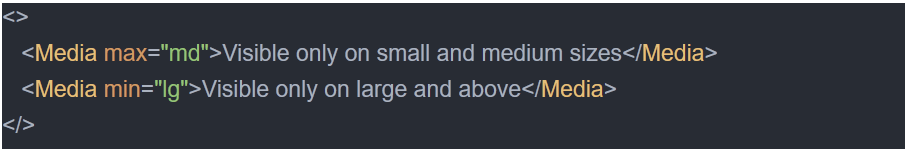
Component <Media /> is responsible for rendering components only for chosen resolution intervals and have attributes min and max, which take values from breakpoint settings.
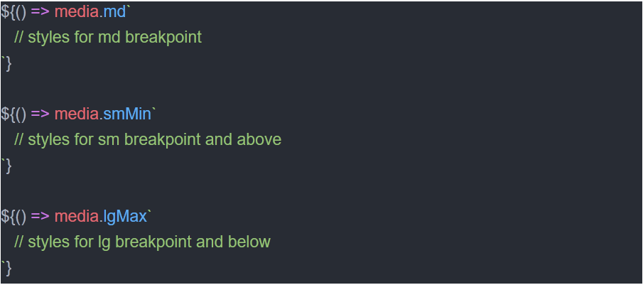
We have also used mixin ‘media’ for styled components, which allows us to write specific styles for every breakpoint. Each of them has an additional suffix (‘min’ or ‘max’) designed to define styles for the division and for smaller and larger sizes.
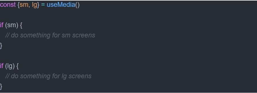
We have also prepared the hook ‘useMedia’, which brings back the object with Boolean values for every breakpoint defined in settings:
CSS variables for the win
As mentioned at the beginning, our stack is based on ReactJS and Styled-components. Crucial for performance within this library is the reduction of component re-rendering. And this is the perfect opportunity to move the responsibility of visual changes into css. It wasn’t feasible up until the moment when css variables were introduced. Instead of passing, for example, component dimensions as props you can create a css variable and pass it into your component. Just look at the example below:

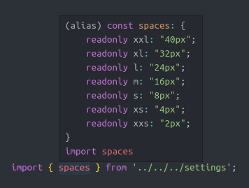
Space component
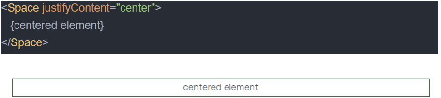
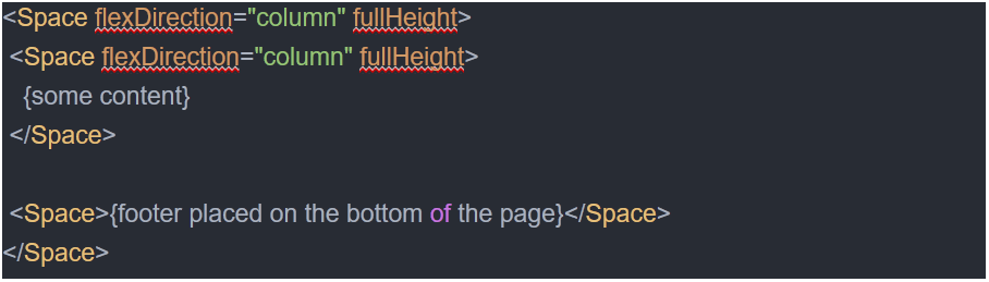
The <Space /> component is one of our favorite solutions 🙂 The original requirement was to have a universal component responsible for spacing in each area of the application and enabling quick assembly of layouts. Many libraries include a similar box component already, but we wanted to create our own adapted to the needs of the application. Let’s look at the situations in which it’s been helpful to us:
Responsibility for spacing
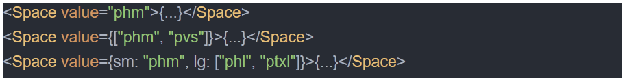
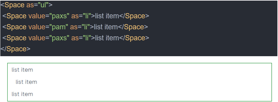
The props ‘value’ is made of three parts: property (‘p’adding, ‘m’argin) – direction (‘l’eft, ‘b’ottom, ‘a’ll, ‘h’orizontal, ‘v’ertical) – size (s, m, l… whose values are defined in settings). We can also pass these values for different screen sizes.
Centering elements
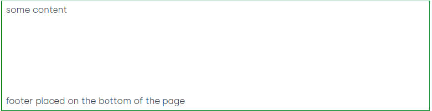
Layout with a footer glued to the bottom edge
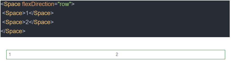
Split into two columns
List of items
Setting background

Typography
Handling typography was another key feature that we are really proud of. We accomplished it by using a custom Text component, which accepted content as its children. In the early stage of the project our product designers pointed out several variants of typography and agreed to use them across the whole application. This enabled us to create a config with proper font styles and that was it. Later the user would simply add:
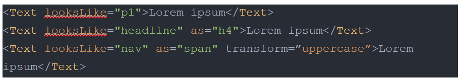
This simple delegation of a specific function to one component turned out to be pretty handy, because later on there was no need to add custom font styles in other components (maybe with the exception of inputs). Moreover, we extended Text props, so the component could align its content, set it to uppercase or change the display from block to inline-block in the case of nested Texts.
Red or blue?
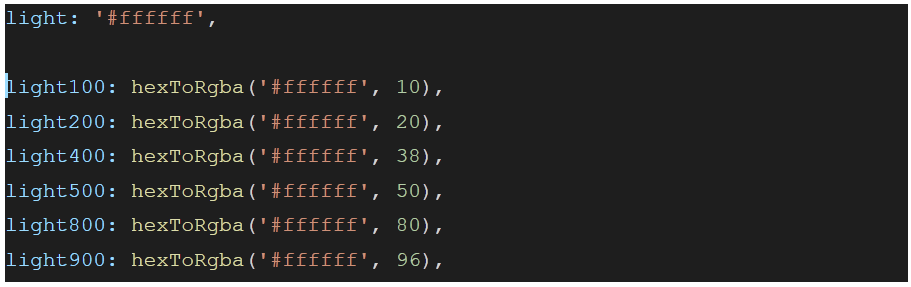
The hardest thing for us turned out to be naming colors. We didn’t want to add “red” or “blue” variables, because we had in mind that in next week “red” could change to “yellow” and “blue” would be a gradient. Also shading was tricky as we didn’t want to bump into adding “dark” or “darker” suffixes. We prefer names that don’t represent color in itself, but rather its function. So we came up with some pretty abstract nomenclature – the main color of the application was named “primary” and the second-in-command “secondary”. Error messages were in “negative” and success messages in “positive” colors. Our design used a variety of dark and light colors with different opacity values. We didn’t want to reinvent the wheel and we turned to a concept adopted in Material Design. The scale of shades was sorted from the lightest to the darkest and each shade received a number suffix:
Using a theme
Another awesome concept was keeping the theme object accessible to all components. In our project we used styled-components, so accessing the theme was pretty simple. Generally we kept in the theme all properties associated with colors, such as background color, font colors, border color. Such an approach enabled a pretty fast switch of colors in the case of a sudden presentation to a new customer. A global object with common styles can cause developers to store in it all properties, for example border radius or dimension values. We strongly discourage taking this path as the theme can grow rapidly from now on, making it difficult to read. Moreover, width or height are values pretty specific to components. Any change to them should be well tested as it can easily break components. Keeping only variables that don’t generate unwanted side-effects in the theme enables less front-end oriented people to change the theme and play around with it, adjusting the look of the component to their preferences.
One to rule them all
Have you ever found yourself in a situation where you had to change all border radiuses from 2px to 4px, because of a design modification? I bet that every person in that situation would think “I should have assigned it to a variable so I would have to only change one line of code”. We thought about it at the beginning of our journey and created a settings folder in which we kept files with configs for transition times, border radiuses, padding/margin values etc. All thanks to close collaboration with our design team, which was mentioned above. Working with predefined values of common properties turned out to be painless and efficient. Also, in case of global border radius modification, we would have to change only one line of code.
Summary
As you can see from the article above, developing a UI library requires consistency and prediction. Every component should be created with deliberation and be extendable without crashing the rest of the application. But if you create some patterns and follow them strictly, working with this kind of project can be really enjoyable and the result is undeniably helpful to the rest of your team.

Read also: Future technology predictions: interfaces move towards multimodal and subconscious